Part 2. The FLOAT Method
2.6 Tell
Telling Your Data Story
Tell
The way information is communicated is of critical importance to both the comprehension and delivery of a given subject; therefore, there is no substitute for a solid design. After reading this chapter, your goal should be for your audience to be able to determine the message of your visualization(s) and to do so quickly. Often, a secondary goal is to have the audience be able to drill down further to continue to explore your findings at a more granular level. Furthermore, accessibility within data visualization is essential because it ensures that all intended users can access information, including those with with disabilities.
Methods of design intended for users with disabilities also benefit those without disabilities. Let us begin by exploring the types of visualizations and how to first make selections based on the type of data you will be visualizing. After that, the chapter will detail elements of effective design and provide critical concepts on how accessibility is incorporated within data visualization.
If you take the time to understand the reason for your data visualization efforts, you can shape the story to your targeted audience’s sensibilities. Your part in creating an effective design for a data visualization boils down to choosing the right type of design to tell a coherent, inspiring, and widely accessible story.[1]
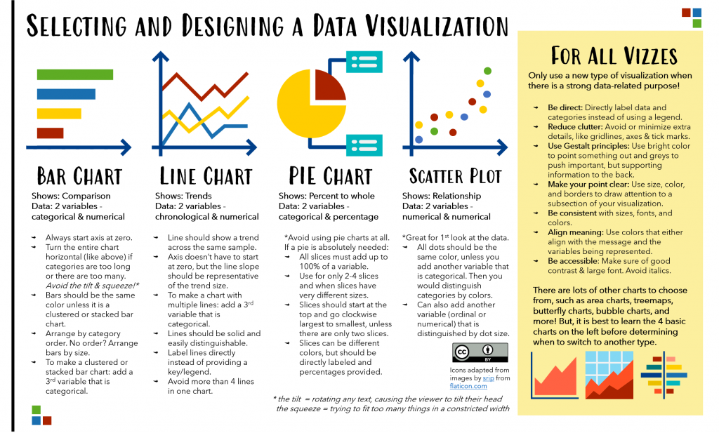
Some of the most common types of visualizations are column/bar charts and histograms, line charts, pie charts, and scatter plots. There are innumerable other visualizations, including treemaps, area charts, filled tables and heatmaps, bubble charts, and choropleth maps that can be further explored for specific uses.
Getting Started with Visualizations
First, you will want to determine whether you even need a chart. Are you trying to highlight an impactful number or even a set of numbers that are not relatable or comparable to one another? In that case, you may want to present numbers as simple text. These can be visually presented so that they stand out without creating a visualization because the latter would require some comparison.
If you find you have several elements to compare, then here are some tips to keep in mind when selecting and developing your visualization. When selecting a visualization type, make sure it is most appropriate for your data. We go into more detail about this in the following sections. Once a selection has been made, you should have an idea of the message the visualization should be delivering. The message should be reinforced by text and design.
Design principles call for you to focus or attract the eye to the most important area or piece of information from a visualization, while “pushing back” supporting (but still important) information. Information that is neither important nor supporting should be removed from a visualization in a process called decluttering. This can include removing extra lines and tickmarks, many of which are default features in many visualization tools. It can also include directly labeling information on the visualization, rather than making use of keys/legends that require a viewer to dart their eyes back and forth and try to memorize which symbol, bar, or line represents which category from the legend.
Be sure to avoid adding clutter as well. These are features that can distort the ability to view size (such as 3D or rotated visualizations and rounded edges), adding colors that do not symbolize anything, or other elements you may add for the sake of pizzazz (rather than added to highlight or point out a finding).
Another thing you will notice from the example visualizations in this chapter is the use of text. It is best practice to provide a clear descriptive title for your visualization. If that is not enough to make the message clear (such as in situations where a title is just a summary of what is being visualized), it is important to add additional text to clearly state the message you would like the viewer to take away from the visualization. It is also best to align all text to be left-justified (or right-justified, in some cases), rather than sitting in the center, since we mostly read and consume text most clearly from left-to-right.
So, how do you select a chart? To make sure your chart is highlighting the point you’d like to make, determine the ultimate message of your visualization. There may be several points you are trying to make, but you will need to select one as the most important. Select from one of the following four messages: (1) relationship, (2) distribution, (3) composition, or (4) comparison. From there, you can begin to effectively choose a visualization type.

Now let us take a closer look at the most common charts to examine them in more detail.
Bar and Column Charts
Bar charts are most often used when comparing categorical variables. Think about variables like Gender, Race/Ethnicity, Song Titles, and Days of the Week. These are referred to as nominal data. o If they have a logical order, like Months in a Year or Age Groups, they are called ordinal data.
Bar charts are used to compare categories across a numerical difference of some kind, such as averages, percentages, and totals. Bar charts are the most preferred data visualization method because all the bars begin at the same straight line starting point, and their sizes are easily distinguishable against one another. Bar charts also allow for clear data labels without cluttering the chart too much.
Types of Bar Charts and Best Practices
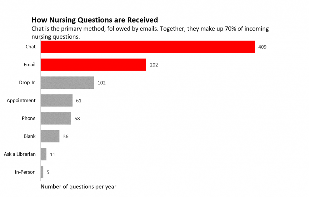
Column charts are simply vertical bar charts. However, it is best to use a horizontal bar chart (as pictured below) instead of a column chart when the data labels’ names are long or if you need to display negative values.
Bar charts of any kind are easiest to read when the bars are directly labeled. See the example below with both the category name and the value provided for each bar.
Bars should also be all one color; however, when pointing out a group, those can be colored together to draw the viewer’s eye to where you want them to pay attention. In data visualization, supporting details are provided in grey so that they are available but also pushed back from immediate attention.
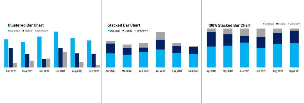
There are many types of bar charts based on their uses. Bar charts can be used to show the breakdown using more than one category through various other elements, like stacked bars and clustered bars. Clustered bars are preferred for adding an additional categorical variable (since all the bars begin at the same starting point and are able to be more easily compared in size). Other types of bar charts include the 100% stacked bar chart which may be a good alternative to a pie chart since it is meant to show proportion of parts to a whole, rather than size of raw numbers.
The histogram is a bar chart where data is provided in bins. So, checking the frequency of certain data, you can bin together these data in ranges to see how your data is distributed in your dataset. This was discussed in more detail in the Formulate chapter since histograms are often used for exploration and getting to know one’s own data.
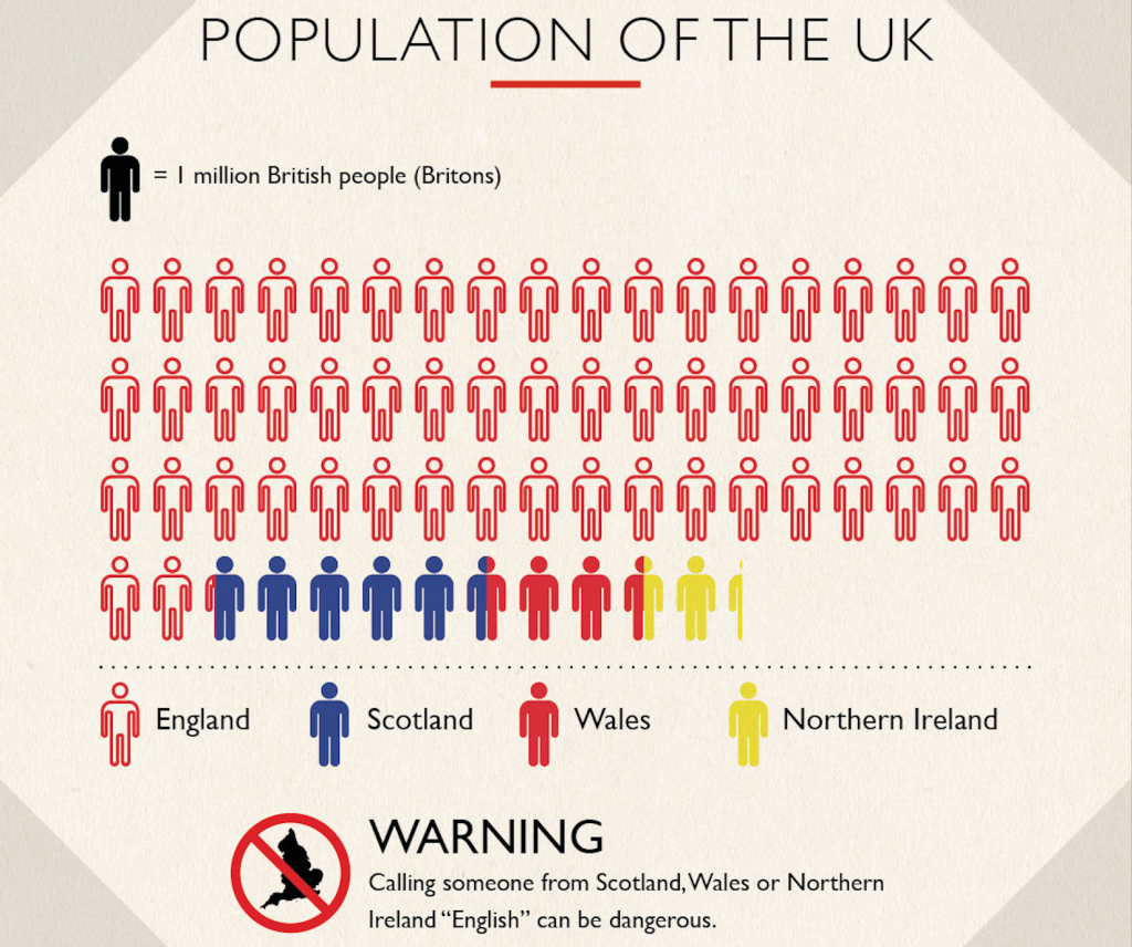
The last type of sort-of bar chart is the pictogram chart (as shown below in the infographic about the Population of the UK). This type of chart uses a series of icons, where each icon represents a quantity or value. These are preferable to replacing an entire bar with an icon, but they have their weaknesses in that the icons may be too detailed, making the overall visual hard to process.
So, it is best to stick with simple icons when creating a pictogram. Pictogram categories can be lined up separately like a bar chart, or combined in one block (as in the Population of the UK infographic) where the categories are listed continuously.
Regardless of whether it is a simple horizontal bar chart, vertical column chart, histogram, clustered or stacked, the bars must always begin at zero because the size of the bar is what indicates the value. Beginning the axis at a number greater than zero introduces bias in your messaging and creates a misleading chart.
Line Charts
Line charts are the second most common chart; these present trends and progress over time (chronological variable) for a numerical variable. However, the data must be continuous, which means regular collection from a sample over time.
For example, the number of awards received annually for a particular song would be something to visualize in a line chart. When designing a line chart, it is best to use solid lines to ensure clarity; however, different colors can be utilized to compare lines stemming from an added categorical variable. However, it is still important to reduce clutter by avoiding having too many lines (5+) on one chart or by distracting data points and gridlines.
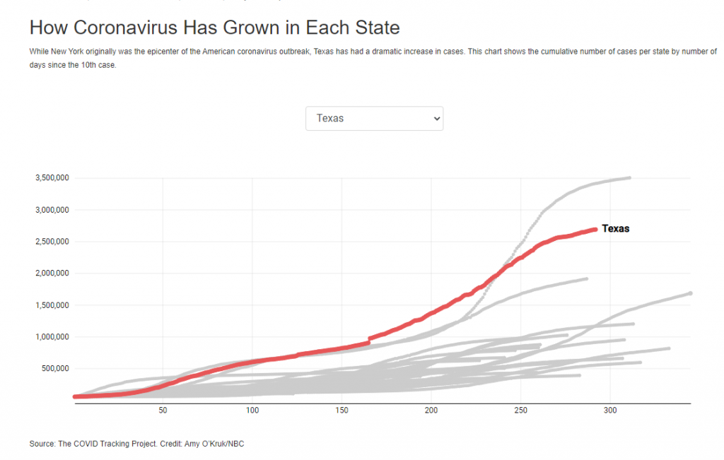
There are ways to overcome a cluttered line chart. You can use color to distinguish one line from the rest (in grey) in order to show where one category stands out from others. Take the example in the figure of coronavirus cases below: although there are 50 lines (one for each state), the intent is to highlight how one state compares to the rest.
Unlike bar charts, line charts do not need to start at zero. The typical rule-of-thumb is to make the height of the y-axis so that lines take up roughly 2/3rds of the chart’s height. However, it is important to keep misleading messaging in mind. If the numbers are almost to 100 with an overall rate change of 0.5%, making the chart begin at 98 and going to 101 can lead to a misleadingly sloped line that is not really representative of the fact that the numbers haven’t changed much.
The topic being covered makes a big difference. A difference of 0.5% means something incredibly different when looking at enrollment in a class versus grade point average, versus incidence rate of an incredibly dangerous disease. Therefore, it is important to keep context in mind when determining the range of values on the y-axis.
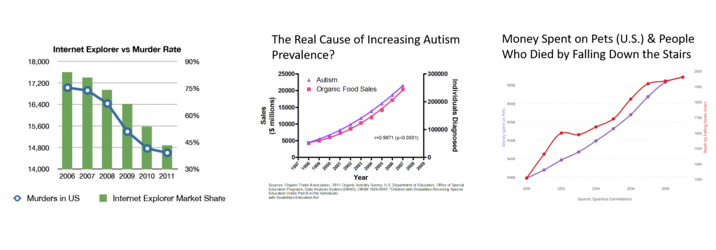
A dual-axis chart is a type of visualization in which one x-axis is shared amongst two y-axes, and it is used most often for line charts or to add a line chart to another type of visualization. This chart can be incredibly misleading if the two things being compared do not relate to one another or their scales are selected in a way to make them look as if they have a shared trend.
In the examples below, we can see that almost any two trends can be made to look correlated if the proper subsection is selected and the axes are scaled so that the lines or trends match up, regardless of how different. This goes back to the need to have disciplinary expertise in order to determine whether the trends can be associated together in a visual because (1) there are actual effects, and (2) it would not make the viewer overly confident of potentially preliminary or hypothetical conclusions.
Pie Charts
Pie charts are extremely controversial, with many data visualization experts saying they should never be used since the data is more clear in a bar chart. See the video below which shows an example of this.
However, pie charts can present data as percentages of a whole. The sum of all the data should equal 100% of something. A pie chart of the percentages of smokers for each race in the U.S. is still inappropriate for a pie chart even if it adds up to 100% because the percentages are within each race. Instead a pie chart of smokers with a slice representing the percentage of total smokers that belong to each race is more appropriate. So, it is important to determine if the parts add up to one shared whole before proceeding with a pie chart.
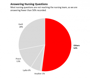
It is helpful to limit the number of sections or “slices” within the pie chart because it does not take many slices to make it impossible for a viewer to distinguish the sizes of the slices. Therefore, pie charts are typically used when there are 2-5 slices and each slice is drastically different in size from the others. It is often best to point out a particularly small or large pie slice. Notice the example provided here.
Scatter Plots
Scatter plots are visualizations that show the relationship between two numerical variables. They can also be used to highlight trends and outliers. As mentioned in the Formulate chapter, scatter plots are highly recommended for getting an initial view of your data to see where your points lie, particularly if you plan to run any statistical tests.
This rationale is highlighted in the famous Anscombe’s Quartet, as addressed in the Formulate chapter. Scatterplots also reveal somewhat how closely data exist along a trend line. Adding trend lines to the visualization can emphasize relationships, but the human eye is not perfect at determining how well dots fall along the trend. So, it is best used to give a general idea and provided along with supporting details making the relationship clear. Bubble charts can be used to present relationships and distributions. They are similar to scatter plots; however, they include a third (ordinal or numerical) variable presented as bubble size.
Accessibility
Accessibility is a measure of how well any person can access, engage with, and benefit from materials. Failure to design accessible visualizations can lead to poor understanding or the complete lack of the ability for some to view or interact with your visualizations. In addition, many of the same practices used to be inclusive of those with disabilities are also beneficial for others.
Some methods for incorporating accessible design include giving users different options for processing the same material, providing alternative text and captions, and using a color contrast checker to ensure that the contrast between text and background color provides easy reading. Having the right color scheme is essential when accommodating users who are color-blind. One way to address various types of color-blindness is to also have differences between colors’ hues, saturation, and values.
Also, be sure to limit movement on the page as it may serve as a distraction. In other words, make sure that any animations that have an automatic start and a way for viewers to stop/pause it. Lastly, when using bold or italics in away that is not in conjunction with a semantic element, it can cause issues for those using screen readers since screen readers may not indicate that certain text is in italics or bolded.
Design with Assistive Technologies in Mind
Keep in mind that many disabled users utilize assistive technologies such as screen reader software, which reads texts out loud, which can help them navigate through online spaces. The following list are things to keep in mind to accommodate students who utilize assistive technologies:
- Use semantic elements – Organized sections accurately using the right content organizers. Users who depend on screen readers can jump from heading-to-heading quickly and navigate through the materials to provide.
- Use descriptive hyperlinks – Screen readers can also jump between hyperlinks; therefore, it would be beneficial to title hyperlinks with more descriptive texts. Rather than just using “click here,” try titling the link with what the content is (for example, using “click the video transcript”).
Conclusions
Successful data visualizations require a great deal of purpose, thought, and practice. Over time, as you become familiar with best practices for the most common visualizations, you can begin to explore best practices for designing other common visualizations, such as maps. Ultimately, the process involves thinking outside of oneself to make the visualization understandable and clear for the broadest amount of an audience or audiences. So, take your time in selecting and designing and seek the input of others in order to find out about areas of needed improvement.
By Peace Ossom-Williamson
Portions of the chapter are adapted from the following sources:
Durcevic, Sandra. “Designing charts and graphs: How to choose the right data visualization types.” The datapine blog, 2 May 2019, https://www.datapine.com/blog/how-to-choose-the-right-data-visualization-types. © [fair use analysis].
Media Attributions
- Figure 2.6.1 – Selecting and Designing a Data Visualization © Peace Ossom-Williamson is licensed under a CC BY (Attribution) license
- Figure 2.6.3 – Example Horizontal Bar Chart © Peace Ossom-Williamson is licensed under a CC BY (Attribution) license
- Figure 2.6.4 – Types of Bar Charts © Peace Ossom-Williamson is licensed under a CC BY (Attribution) license
- Figure 2.6.5 – Population of the UK is licensed under a All Rights Reserved license
- Figure 2.6.6 – how-coronavirus-has-grown-in-each-state © Amy O’Kruk
- Figure 2.6.7 – A Dual Axis Can Mislead
- Figure 2.6.8 – Example Pie Chart © Peace Ossom-Williamson is licensed under a CC BY (Attribution) license
Data visualization refers to the techniques used to communicate data or information by encoding it as visual objects (e.g., points, lines or bars) contained in graphics. The goal is to communicate information clearly and efficiently to users.
