Part 4. Digital Tools Explained
4.1 Microsoft Excel
What is Microsoft Excel?
Microsoft Excel is a spreadsheet developed by Microsoft that features calculation, graphing tools, pivot tables, and various formulas and functions called Visual Basic for Applications. Excel can be used to store and organize data and create datasets.
Microsoft Excel performs a range of statistical functions such as carrying out calculations and presenting sums and percentages, which makes these programs ideal for sorting, filtering, and storing data. Formulas are among one of the stand-out features of this spreadsheet programs. Formulas facilitate the data analysis process with many of the popular programs including a wide range of preset functions preventing users from having to type in commands manually. Microsoft Excel files are also sustainable and can be converted and saved in a variety of formats. Among one of them is a comma separated value, or .CSV file, that allows data to be saved in a tabular format.
This chapter offers basic tips for getting started with Microsoft Excel.
Getting Started with Excel
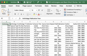
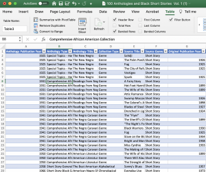
What follows is information on how to perform basic functions in Excel working with “The Black Short Story Dataset – Vol. 1.”
Sort
The “sort” function enables users to order information in one column or multiple columns in ascending or descending order.
To sort on one column, follow these steps:
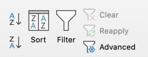
- Click any cell in a column you want to sort.
- Click on the Data tab in the Sort & Filter group
- ClickAZ to sort in ascending order (or click ZA to sort in descending order).
Filter
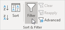
Filter your Excel data if you only want to display records that meet certain criteria. To filter data, follow these steps:
- Click any single cell inside a data set.
- Click on the “Data tab,” in the Sort & Filter group
- Click Filter.
- Click the arrow next to “Anthology Type.” Click on “Select All” to clear all the check boxes, and click the check box next to “Short Story Black Collection.” The data will filter to display only the information associated with that category.
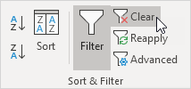
- To remove the filter: Click the “clear” button in the Sort & Filter group to remove the filter and the arrows, click Filter.
Charts
A simple Excel chart can say more than a sheet full of numbers.
To create any chart, follow these steps:
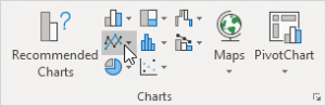
- Select the range of data
- Click on the “Insert tab,” in the Charts group
- Click the Line symbol.
To change your chart to a different type, follow these steps:
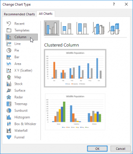
- Select the chart.
- Click on the “Design tab,” in the Type group,
- Click Change Chart Type.
- Click the type of chart you desire, on the left side.
If you want to switch the horizontal and vertical axis on a chart, follow these steps:
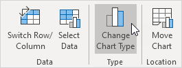
- Select the chart.
- Click On the Design tab, in the Data group
- Click switch Row/Column.
Tables
To insert a table, execute the following steps.
- Click any single cell inside the data set.
- On the Insert tab, in the Tables group, click Table.
- Excel automatically selects the data for you. Check ‘My table has headers’ and click on OK.
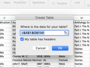
- Result. Excel creates a nicely formatted table for you. This may still seem like a normal data range to you but many powerful features are now just a click of a button away.
Sorting & Filtering a Table
To sort or filter a table, execute the following steps.
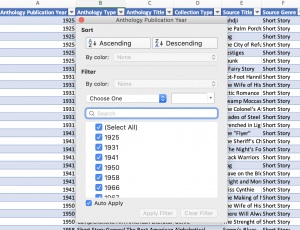
- Click the arrow next to column header.
- Choose to either sort numerically/alphabetically or filter by a given variable
Pivot Tables
Pivot tables are one of Excel’s most popular features. A pivot table allows you to extract the significance from a large, detailed data set.
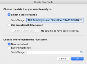
To insert a pivot table, execute the following steps:
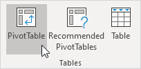
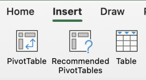
- Click any single cell inside the data set.
- Click on the “Insert tab,” in the Tables group
- Click PivotTable and the following dialog box appears (See below)
- Click OK (Excel automatically selects the data for you and creates a new worksheet for the data).
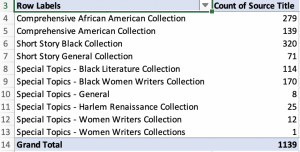
Experiment with Pivot Tables
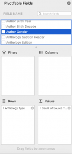
The PivotTable Fields pane appears. To explore the dataset and figure out how many short stories are republished across the various anthology types, drag the information into the following fields. get the total amount exported of each product, drag the following fields to the different areas.
- `Select “anthology type” and drag to “rows”
- Select “source title” and drag to “values”
The pivot table will only display the selected information that you specified.
This chapter was adapted from Excel Easy.
Media Attributions
- Figure 4.1.1 – Sort © Kenton Rambsy
- Figure 4.1.2 – Filter – Excel
- Figure 4.1.3 – Clear Filter – Excel
- Figure 4.1.4 – Insert Line Chart – Excel
- Figure 4.1.5 – Create Column Chart – Excel
- Figure 4.1.6 – Change Chart Type – Excel
- Figure 4.1.7 – Excel Sheet – Anthology © Kenton Rambsy
- Figure 4.1.8 – Table © Kenton Rambsy
- Figure 4.1.9 – Create Table © Kenton Rambsy
- Figure 4.1.10 – Black Anthology Table © Kenton Rambsy
- Figure 4.1.11 – Sorting Anthology Table © Kenton Rambsy
- Figure 4.1.12 – Insert Pivot Table © Kenton Rambsy
- Figure 4.1.13 – Pivot Tables © Kenton Rambsy
- Figure 4.1.14 – Pivot Table Fields © Kenton Rambsy
- Figure 4.1.15 – Table © Kenton Rambsy
