10 The IE Approach
Chapter Table of Contents
Process Improvement
How does an IE create a process to reliably produce a product or service with specified requirements? While the definition of industrial engineering says “the design or improvement” of a system, most IEs are involved in improvement. The IE approach is to continually improve the system.
In Good to Great[1], Jim Collins found a focus on continuous improvement in the companies he studied: “Visionary companies focus primarily on beating themselves. Success and beating competitors comes to the visionary companies not so much as the end goal, but as a residual result of relentlessly asking the question ‘How can we improve ourselves to do better tomorrow than we did today?’ And they have asked this question day in and day out – as a disciplined way of life – in some cases for over 150 years. Nomatter how much they achieve – no matter how far in front of their competitors they pull – they never think they’ve done ‘good enough.'”
Improving the whole system at once is hard, so the IE focuses on a particular process in the production system. A process can be described as any activity or group of activities that takes an input, adds value to it, and provides an output to an internal or external customer.
Plan-Do-Check-Act (PDCA) and Define-Measure-Analyze-Improve-Control (DMAIC) are two acronyms indicating the steps an IE does to improve a process in a production system.
PDCA
PDCA stands for Plan, Do, Check, and Act. The steps were developed by Shewhart and popularized by Deming; they are sometimes called the Shewhart Cycle.
- Plan – Ask and answer the following questions. What data do we have to help us plan improvements? What part of the organization should we work on next? Where do we have the biggest problems? Where do we think we can make the biggest improvement? What improvements could we make? What experiments could we do to get us data to evaluate proposed improvements? How would we analyze those data?
- Do – Carry out the planned experiments to test the various proposed improvements.
- Check – Observe the effects of the experiments. Analyze the data from the experiments. Decide which improvements, if any, should be implemented.
- Act – Reflect on what was learned. Implement the improvements that have been shown to be effective, or repeat the cycle focusing on specific improvements that show promise but need more refinement.
When you are done with PDCA, you do it again. Or, in other words, you are never done because you must practice continuous quality improvements. The American Society for Quality has a good summary of the steps and a links to a three-part webcast series that may be interesting to you.
DMAIC
DMAIC stands for Define, Measure, Analyze, Improve, and Control.
- Define – Select a process for improvement. The project champion assigns a project team and give them a project charter. Develop a preliminary process map. Use the Voice of the Customer to determine real requirements.
- Measure – Determine the current status of the process. Determine performance measures. Identify the gap between current status and desired status. Identify the critical process inputs (the Xs) and critical process outputs (the Ys). Develop a detailed process map. Determine possible root causes for the problems.
- Analyze – Evaluate the contributions of various possible root causes. The emphasis is on rigorous analysis of data.
- Improve – Test possible improvements through designed experiments. Develop an implementation plan for the ones that are shown to best meet the project objectives.
- Control – The project champion carries out the implementation plan. Sustain the improvement by training workers and by implementing control charts. As with PDCA, when you are done DMAIC, you do it again.
Process Redesign to Reduce Cycle Time, by D. Bandyopadhyay, describes an example.
PCDA, DMAIC, and other versions all have in common these important features:
- Make sure you are solving an important problem.
- Use a team to generate ideas because a group of people can generate more ideas than any one individual.
- Use facts, experiments, and data for decision making.
- Continuously improve quality.
PDCA and DMAIC are very similar, but have some differences. Since it is sometimes called the Shewhart Cycle, PDCA emphasizes more the need to repeat the steps, while DMAIC adds the Control step lacking in PDCA.
PDCA and DMAIC Tools
Both PDCA and DMAIC use these tools:
- Teams
- Documentation
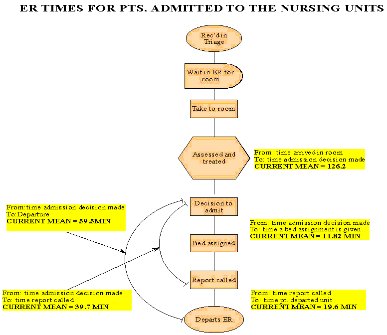
- Process flow diagram or flowchart
- Documentation
- Check sheet
- Histogram
- Pareto chart
- Brainstorming and Nominal Group Technique
- Defect concentration chart
- Cause and effect diagram or fishbone diagram
- The five whys and root cause analysis
- Regression analysis
- Design of experiments and analysis of variance
- Control charts
Teams. Continuous improvement of a process requires the involvement of everyone who works on that process. A team is usually created to focus on a particular problem or a particular process, but may include people who work in the processes that provide input or receive the output from the process being studied. For example, a team to improve the process of moving patients from the Emergency Department to a hospital room should include people who move the patients, but should also include people who work in the Emergency Department as well as people who work in the hospital. Team members may need training in some of the tools described below and support from staff people for data analysis.
Documentation. According to Robitaille (page 65):“If the documents aren’t correct, the system will always have problems.”

Check sheet. An important type of documentation is to routinely record all exceptions and problems. Each instance of a problem may seem to be isolated, but analysis of such data may turn up problems that should be studied and fixed. A check sheet is a simple chart allowing workers to put a check mark next to the type of problem that has occurred, or to record by hand a problem that does not fit into the types listed. This example of a check sheet used to record the reason for telephone interruptions is a useful resource.
Histogram. Categorical data such as data recorded in a check sheet can be displayed in a histogram. The relative number of different types of problems is easier to see in such a visual display. Here is a video from the Khan Academy explaining how to develop a histogram.
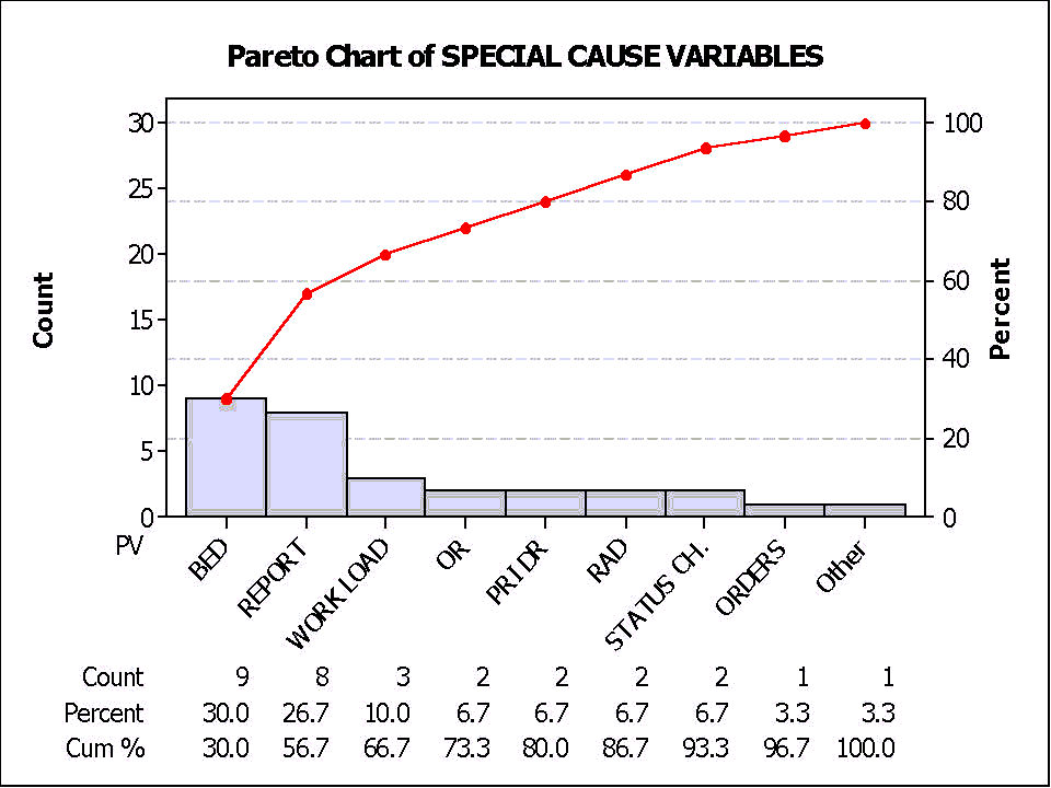
Pareto chart. A Pareto chart is a special type of histogram in which the categories are listed from most frequent to less frequent. The following Pareto chart from Parkview Hospital shows the causes for a delay in moving a patient from the Emergency Department to a hospital bed.

Putting the items in order by frequency means that the biggest cause is listed first; that cause is usually the one that should be focused on first. If you can fix the biggest causes, then you will have eliminated a large proportion of the defects.
The Pareto principle (named after economist Vilfredo Pareto, but generalized by J. M. Juran) is also sometimes called the 80-20 principle. Juran wrote: “Managers are well aware that the numerous situations and problems they face are unequal in importance. In marketing, 20% of the customers (the ‘key’ customers) account for over 80% of the sales. In purchasing, a few percent of the purchase orders account for the bulk of the dollars of purchase. In personnel relations, a few percent of the employees account for most of the absenteeism. in inventory control, a few percent of the catalog items account for most of the dollar inventory. In cost analysis, roughly 20% of the parts contain 80% of the factory costs; the basic function of a product accounts for 80% of the cost, while the secondary functions account for only 20% of the cost. In quality control, the bulk of the field failures, downtime, shop scrap, rework, sorting, and other quality costs are traceable to a vital few field failure modes, shop defects, products, components, processes, vendors, designs, etc.”
Figure 10.2 shows Parkland Hospital had 9 causes for delay; 20% of 9 is 1.8 or about 2. The largest 2 causes (Bed and Report) account for only 56.7% of the problems, so we can see that the Pareto rule doesn’t always hold. It is, however, often a useful guideline.
Defect concentration chart. Sometimes defects or other problems can be recorded or displayed according to location. For example, breakdowns of machines can be displayed on a map of a factory to determine if the breakdowns are occurring in a particular area. Defects in welds on a product can be displayed on a diagram of the product to see if the weld defects are concentrated in a particular part of the product. You can see an example of how concentration diagrams are used here.
Brainstorming and Nominal Group Technique. Usually everyone on the team has ideas about why the problem is occurring. However, a good process should be used to develop a list of possible causes to avoid the team from focusing too early on just a few causes. Team brainstorming usually works best with these steps:
- Clear statement of the problem or issue for which ideas are being generated. For example, generate possible causes why customers sometimes receive shipments that are missing items.
- Silent generation of ideas by each individual, writing on paper.
- Round robin collection of ideas, recorded on a board or flip chart visible to all. Each person gives one idea during each round, and can “pass” during any round. During this step, ideas are not evaluated. The more ideas and the more different the ideas, the better. After a round in which all pass, some time should be allowed for all to think a bit more. The facilitator should be sure to encourage everyone to volunteer all the items generated during the silent generation. Sometimes people are hesitant to volunteer ideas that differ from what others have said, but one of the values of working in a team is the generation of different types of ideas.
- Clarification and combination of ideas. Often some ideas are similar in concept, but different in wording. The team works together to clarify and combine ideas. Ideas should not be overly combined; if the person who volunteered an idea wants to keep an idea separate, the team should usually defer to that person.
- Prioritization among the ideas. This step is not always appropriate. If the team is brainstorming causes for a problem, data, not voting, should usually be used to determine which causes are more important. If the team is brainstorming ideas for next steps for the improvement, prioritization is needed. If there are 10 or few items, each team member can rank order the items (from 10 for the highest priority to 1 for the lowest) and the sum is used to prioritize. If there are more items, voting can be used to first reduce the list. For example, each person is given a number of votes equal to half the number of items. Each person allocates votes; votes can be allocated all to one item (expressing a strong preference), or allocated among items. Sometimes colored dots or colored pens are used, so the team’s preferences are visible and can be discussed.
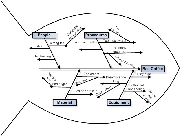
Cause and effect diagram or fishbone diagram. Often causes can be grouped into overall categories such as people, equipment, methods, and materials. The figure below includes those labels on what are called the major bones of the fishbone, with more specific ideas categorized under those labels. Smaller lines can be included as needed.

The five whys and root cause analysis. Root cause analysis (RCA) is an in-depth investigation into the cause or causes of an identified problem, a customer complaint, a nonconformance, the nonfulfillment of a requirement, or an undesirable condition. The goals are:
- to determine why the situation occurred, tracing back in time through previous steps in the process, and
- to prevent the situation from occurring again.
The goal is not to blame a person, but to fix the system. One approach is to continue to ask “why” at least five times. An IE keeps asking “why?” until the root cause is identified for a problem:
- Why did the customer receive the wrong shipment?
- Because the wrong shipping label was put on the customer’s shipment.
- Why was the wrong shipping label put on the customer’s shipment?
- Because some shipments were removed from the shipping department.
- Why were the shipments removed?
- Because the customer had made some last minute changes to the order.
- Why did the customer make some last minute changes?
- And so forth.
Regression analysis. A scatter diagram shows the effect of only one variable on the variable we are studying. More sophisticated analysis allows for more independent or explanatory variables. With more variables, plots cannot be used, but the mathematical techniques of regression analysis can indicate which variables are most important in explaining the variation in the dependent variable, that is, the variable being studied.
Design of experiments and analysis of variance. After careful analysis of data, a team may have some good ideas about why the problem is occurring and may have some good ideas about how to fix the problem. A carefully designed experiment can test these ideas. The analysis of variance (ANOVA) is a mathematical technique (like regression analysis) for determining which variables have the most effect on the variable being studie.
Control charts. Key measurements of a process should be monitored to make sure that the process is functioning within the required limits. The design and use of control charts requires mathematical analysis to distinguish natural variation in the system from clear indications that the process has changed.
Exercise
- Collins, J. C. (2001). Good to great: Why some companies make the leap ... and others don't. New York, NY: HarperBusiness. ↵

