Part 2. The FLOAT Method
2.5 Analyze
Garnering Findings from Data
Data analysis is becoming an increasingly important part of digital humanities work, and three particular areas of analysis—exploratory data analysis (EDA), data visualizations, and statistical computing—are central to the digital humanities. The Chapter 2.2 Formulate covered EDA and data visualization. Therefore, this chapter will continue what was discussed, going into statistical computing.
Analyze
Data analysis is a broad term that encompasses any method of using data to come to a finding. This can be as simple as counting things. Visualizations of data, summary tables, and descriptive statistics are all used to show findings of varying amounts of complexity and importance.
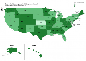
For example, the article “Reporting and Availability of COVID-19 Demographic Data by US Health Departments (April to October 2020): Observational Study” is an analysis of data being provided by health departments about COVID-19 during the pandemic. While some statistical tests were run, the majority of the findings are displayed on a three-part map, seen below, showing what types of information are being shared with the public over time.
Map of COVID-19 Data Availability, October 2020
Pivot Tables
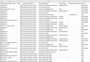
Pivot tables are a method of summarizing datasets. It is based on turning categories into averages, sums, counts, and other statistics, making it useful to recognize patterns. For example, looking at the file “Beyonce – Awards.csv” in the “Storytelling with Data – The Beyonce Edition” dataset, we see the following variables: Song Title/Album Title, Year, Award Institution, Award Category, Award Type, International Award, and Result (see image below). These are listed one nomination at a time, totaling 651 rows. It is difficult to come to any conclusions scanning these data.
Beyonce Award Data from “Storytelling with Data – The Beyonce Edition”
Beyonce Award Pivot Table
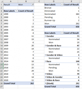
In order to see totals and averages of these data, the categories can be dragged and dropped onto a pivot table. Relationships can even be discovered. When placing some of these data into pivot tables, we can draw conclusions.
Looking at the first pivot table of awards received by year, we observe she has been fairly consistent in being awarded, receiving an average of 12 awards per year since 2001, with her highest awarded years as 2015 and 2017 with 25 and 29 awards received.
In the second table, when looking at all her nominations, she seems to win 2 out of 5 (or 262 won out of the 650 grand total).
In the third table, we can break things up to see if anything stands out when looking at categories according to race and gender. When looking at categories based upon typical nominees and awardees: For Gender & Race awards (such as Best Female R&B) and Race awards (such as Best Urban Song), she wins about half the awards she’s nominated for, but looking at Gender awards (such as Female Artist of the Year), she wins a lot fewer (19) than she was nominated for (73).
Theories and conclusions can be made about how well she does outside of categories that are typically for Black artists and how these numbers reflect recognition of Black artists, including “breakthrough” Black artists who tend to be viewed as those who have transcended their race. Along with critical analysis and subject matter expertise, pivot tables can take a researcher a long way in coming to conclusions about their data.
For information about how to use Microsoft Excel, including making pivot tables in Excel, see Chapter 4.1 Microsoft Excel.
Statistical Computing
Statistical computing is concerned with the design and implementation of software for working with and testing data to make inferences. In contrast with EDA, scientific statistical tools (e.g., SPSS, STATA, and SAS) as well as libraries written to function within general-purpose programming languages allow users to move between many different statistical techniques while also having functionality for cleaning and manipulating the underlying dataset. They thus help avoid privileging preconceived notions of what may be of interest in a particular set of data.
Popular programming languages for working with data, such as R and Python, have thousands of user-contributed libraries for data analysis, manipulation, and visualization. These libraries all operate on the same basic internal data structures (see Chapter 2.3 Organize), allowing for easy interoperability between libraries. Statisticians are able to maintain flexibility while conducting data exploration as a direct result of these libraries that operate with a single programming language, rather than using disconnected one-off tools.
Using a general-purpose statistical programming language greatly increases the available set of methodological approaches to studying humanities data. Many statistical techniques such as unsupervised learning and dimension reduction are only available with use of a language such as R or Python. Topic modeling, for example, is such a ubiquitous method in the digital humanities for understanding the structure of a corpus of texts that newcomers would not be remiss for thinking that it is the only such method.
Unsupervised learning, however, can be applied to learn and visualize different kinds of latent structures in texts. For example, spectral clustering, an unsupervised method for categorizing data, produces a complete hierarchical structure of a corpus. This hierarchy can be visualized in many ways and is arguably a far more appropriate method for studying many corpora.
Unlike latent Dirichlet allocation, the primary technique for topic modeling, spectral clustering requires no external tuning parameters, always returns the same result, and does not require the user to specify the number of latent topics. Techniques such as the singular value decomposition, or dimension reduction in general, offer further approaches to visualizing the structure of texts without forcing documents or topics into discretized buckets.
For information about topic modeling, see Chapter 4.5 Topic Modeling Tool.
Although these libraries require significant technical skill to apply them to any particular dataset, the ability to move nimbly between multiple methods and tools can give humanists the flexibility and nuance they seek. For this reason, we should consider modifying or building on top of extant general-purpose libraries, many of which are open-source libraries. By freeing the time that is now spent appropriating existing frameworks and libraries, DHers can concentrate on developing new modifications for extracting humanities knowledge.
Making use of general-purpose software libraries requires an important shift in DH pedagogy. To fully utilize statistical analysis, one needs to be proficient in programming with a language such as R or Python. One does not need to create R packages, but rather one should be able, ideally, to read and implement existing code to explore, manipulate, and analyze humanities data. Otherwise, users are constrained to exploring a small preset selection of visualizations and have limited avenues for cleaning and summarizing their data through point-and-click tools.
Writing in a programming language also allows for summarizing and publicizing analyses with documented code. Such an approach helps other scholars replicate our studies on datasets as well, providing transparency and reproducibility. At the same time, external tools are useful for running efficient interactive visualizations, and their limited toolsets are often ideal for initial data analysis and curated, public-facing projects. However, they are not well positioned to be the only mechanism for running the iterative experimentation required by exploratory data analysis or to give the full range of possibilities for data visualization.
While it is important for digital humanists to become conversant in the theory and application of data analysis, statistical visualizations, and high-level programming languages, collaborations with statisticians and other computational area experts will be instrumental for pushing advanced computational work in the digital humanities.
No one person can be expected to understand such a wide range of disciplines brought together in the digital humanities in the depth required to develop the innovative insights and methods that are the promise of the field. Rather, the digital humanities should welcome statistics to the table, and this begins by better acknowledging the critical role of statistics in the field.
By Peace Ossom-Williamson
Arnold, Taylor, and Lauren Tilton. “New Data? The Role of Statistics in DH.” Debates in Digital Humanities, edited by Matthew K. Gold and Lauren F. Klein, University of Minnesota, 2019. © [fair use analysis].Portions of the chapter are adapted from the following sources:
Media Attributions
- Figure 2.5.1 – Map of Data Disaggregation Availability in the U.S. by State, October 2020 © Kukhyoung Kim is licensed under a CC BY (Attribution) license
- Figure 2.5.2 – Beyonce’s Award Data
- Figure 2.5.3 – pivot-tables © Peace Ossom-Williamson is licensed under a CC BY (Attribution) license
In statistics, exploratory data analysis is an approach of analyzing data sets to summarize their main characteristics, often using statistical graphics and other data visualization methods. A statistical model can be used or not, but primarily EDA is for seeing what the data can tell us beyond the formal modeling or hypothesis testing task.
Source: https://en.wikipedia.org/wiki/Exploratory_data_analysis
Data visualization refers to the techniques used to communicate data or information by encoding it as visual objects (e.g., points, lines or bars) contained in graphics. The goal is to communicate information clearly and efficiently to users.
Computational statistics, or statistical computing, is the interface between statistics and computer science. It is the area of computational science specific to the mathematical science of statistics.
Source: https://en.wikipedia.org/wiki/Computational_statistics
In natural language processing, the Latent Dirichlet Allocation is a generative statistical model that allows sets of observations to be explained by unobserved groups that explain why some parts of the data are similar.
Source: https://en.wikipedia.org/wiki/Latent_Dirichlet_allocation
