Part 1. Putting Data Driven Research In Perspective
1.1 What is Data Driven Research?
What is Data Driven Research?
Data Driven Research is a subset of the field of Digital Humanities that deals particularly with data analytic and visualization methodologies. This field broadly consists of theories and methodologies from a range of humanities disciplines that inform how a researcher gathers, analyzes, and filters datasets to gain insight about a particular subject.
When data is processed, organized, structured or presented in a given context so as to make it useful, it is called information. Data are the facts or details from which information is derived. Individual pieces of data are rarely useful alone. For data to become information, data needs to be put into context.
With data driven research, scholars are able to harness the power of spreadsheets, text mining software, and public archives to produce visualizations that communicate findings and insight into fields of study. Producing visual stories for online discourse is just one of the exciting possibilities of data driven research. Therefore, we must develop a general working knowledge of data analytics in order to derive insights from datasets.
In this chapter, we will (1) provide a general overview of data driven research; (2) explain why spreadsheets are valuable tools for data analysis; (3) explain how humanists and social scientists can make key contributions to the field of data analysis; (4) use a data visualization to demonstrate how data driven research allows us to comprehend large scale analysis of topics.
Keywords: Data, Datasets, Data Curation, Data Visualization, Spreadsheet, Quantitative Data, Qualitative data.
Understanding Quantitative and Qualitative Data
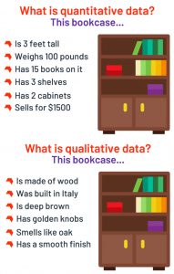
Data is organized into collections known as datasets, which are foundational for data-driven research. Datasets contain quantitative and qualitative data (sometimes both).
Quantitative data can be numbers and values. It can be used to ask the questions “how much?” or “how many?” Qualitative data is descriptive and conceptual. Also, it can be categorized based on traits and characteristics like serial codes and social security numbers since these categorical values are unique to one item or person. Collections of data can be used to perform different types of analyses, derive insight, and produce information.
The most common format for datasets is a spreadsheet, especially .csv formats. These documents are a single file organized as a table of rows and columns. These files can be opened on common spreadsheet applications like Microsoft Excel or Google Sheets. These types of files can also be stored in other formats ranging from a Microsoft Excel document to multiple datasets in a zip file.
Despite there being several advances in computational humanities, however, the role of data curation is often times overlooked, especially when it comes to the humanities and other scholarly disciplines.
Data curation is the work of organizing and managing a collection of datasets to meet the needs and interests of specific groups of people. The creation of datasets is a very labor-intensive and time- consuming endeavor. Curating datasets takes time and a particular type of expertise to create this valuable resource and make it available for researchers. This process also requires access to archival materials.
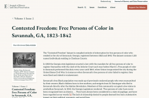
Marquis Taylor, a graduate student in the history department at Northwestern University published “Contested Freedom: Free Persons of Color in Savannah, GA, 1823-1842” in the Journal of Slavery and Data Preservation. This dataset is compiled “entirely of information for free persons of color who resided in the city of Savannah, Georgia, registered between 1823 and 1842” which comprises “1,321 named individuals residing in Chatham County.”
Marquis’s dataset is small only in comparison to a massive dataset that identifies millions of people in the state over several decades, but this project is nonetheless large and significant in other contexts in the humanities. Archiving data is an important aspect of data driven research. If the field is to grow, we need to provide more access points for people to explore topics that traditionally do not make quantitative and qualitative data a central part of the analysis.
Data Driven Research and the Power of Spreadsheets
Spreadsheets are among the most valuable tools for pursuing data-driven research. These widely accessible electronic ledgers, including Microsoft Excel, Numbers, and Google Sheets, are used for storing, managing, and analyzing data. Sorting and filtering options, formulas, pivot tables, and other spreadsheet functions make it possible for researchers to manage thousands of categories and data points.
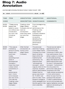
Humanists might find spreadsheets beneficial as well for collecting and organizing sources, performing statistical functions on numerical information, and visualizing data to name just a few tasks. Michael Kramer, an Assistant Professor of History at SUNY Brockport, believes that “lots of data organized in usefully systemized ways and analyzed using the tools of statistics and other more quantitative approaches are worth the time of humanities scholars.” In his “Digitizing Folk Music History” course, Kramer’s students produced detailed analyses, documented their research, and developed “an extended line of meta-metadata that was transitioning out from the evidence to analysis.”
In 2017, Kathleen Clarke, then a Ph.D. candidate in Higher Education at the University of Toronto, described using spreadsheets to organize information for her dissertation. She notes that spreadsheets enabled her to move information around easily and sort information from A-Z or Z-A within a second. Some of the headings she has in her spreadsheet include:
- (1) ID number (2) Author(s) + Year (3) Title (4) Main Findings (5) APA/MLA Reference (6) Type of Resource (7) Abstract (8) Keywords (9) Location – Canada, United States, United Kingdom, Other (10) Notes -quotations I might want to use.
Journalists understand the significance of spreadsheets. The New York Times now conducts workshops on spreadsheets for its employees. The three-week training, based in Google Sheets, teaches participants how to search, sort, and filter information in spreadsheets, while also learning how to work with pivot tables, advanced data cleaning, and visualization techniques.
Lindsey Rogers Cook explained that “Even with some of the best data and graphics journalists in the business … data knowledge wasn’t spread widely among desks in our newsroom and wasn’t filtering into news desks’ daily reporting.” Cook produced a document called “How 5 Data Dynamos Do Their Jobs” to showcase how journalists have optimized the use of spreadsheets to produce groundbreaking work.
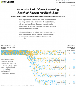
On March 19, 2019, the NYTime’s Upshot published “Extensive Data Shows Punishing Reach of Racism for Black Boys” by Emily Badger, Claire Cain Miller, Adam Pearce, and Kevin Quearly. This visual article examined how Black boys raised in America, even in the wealthiest families and living in some of the most well-to-do neighborhoods, still earn less in adulthood than white boys with similar backgrounds. Understanding how to analyze data in spreadsheets is a first crucial step to creating engaging visualizations that communicate findings.
After items are entered into spreadsheets, they can be re-presented in a variety of ways. The organized information can then serve as the building blocks for data visualizations.
Spreadsheet focusing on hundreds of jazz musicians would assist in highlighting their collaborations and diverse trajectories. Historians that want to map migration patterns and population shifts across regions in the US might organize their findings in a spreadsheet. A spreadsheet that contains census records for each state makes filtering through decades worth of data more efficient. Ultimately, spreadsheets facilitate the process of organizing bodies of information.
Comprehending the Scale of Slavery
As a practice that relies heavily on data analysis, data visualizations are invaluable across a range of fields and professions as people seek to understand the implications of large bodies of information. Visual compositions can help us to comprehend scale and interpret shifts in years, people, and other variables using our eyes. This is beneficial when communicating a story that contains several points.
“The Atlantic Slave Trade in Two Minutes” interactive by Andrew Kahn on Slate represents a powerful possibility of collecting and showcasing data. The visualization displays 315 years and 20,528 voyages of the Transatlantic Slave Trade. The two-minute interactive composition is at once compelling and troubling, for it is ultimately a distillation of the horrifying transportation of ten million enslaved humans presented in 120 seconds.
“The Atlantic Slave Trade in Two Minutes” is an intriguing data visualization with an extended backstory. The project is the product of decades of research that began in the late 1960s when a group of scholars began collecting information about slave trade voyages. Subsequent scholars contributed to the expansion of the data. Today, the Trans-Atlantic Slave Trade Database provides information on more than 36,000 voyages, 91,000 people who were enslaved and thousands of names of shipowners and ship captains. The display of so much information about the slave trade, presented in an interactive brief visualization, indicates the power of innovative data management.
Of course, even a skillfully designed visualization like “The Atlantic Slave Trade in Two Minutes” gives us reason to pause. The use of small dots to represent slave ships and the truncation of 300 years into two minutes trivializes the horrors of enslavement. Thus, responsible creators and viewers must be prepared to consider how data visualizations can simultaneously suppress people’s experiences while at the same time enhancing knowledge.
Visualizations keep the mind entertained and therefore able to process and receive several, interrelated pieces of information. Specifically, this visualization organizes hundreds of records related to the trans Atlantic slave trade, making it easier to remember points and even retrieve information in an efficient manner.
Key Takeaways – What is Data Driven Research?
- Data allows us to quantify and consider the scale or rate at which events or recurring trends happen.
- Data is hardly ever neutral; therefore, a singe dataset can be use multiple type of ways and for several uses.
- Data can be transformed into visuals and be published on online mediums, thereby contributing to online discourses.
- Spreadsheets are valuable beyond academic research for structuring, work data, and other uses. The tools can be used to organize sources, to-do lists, numerical and statistical data, etc
- Pre-Assembled datasets allow for more time to be spent on data analysis and visualizations
By Kenton Rambsy
(See bibliography for sources)
Media Attributions
- Private: Figure 1.1.1 – Quantitative vs Qualitative © Devin Pickell
- Private: Figure 1.1.2 – Contested Freedom by Marquis Taylor © Marquis Taylor
- Private: Figure 1.1.3 – Michael Kramer – Digitizing Folk Music © Michael Kramer
- Figure 1.1.4 – The NYTimes Upshot © Emily Badger, Claire Cain Miller, Adam Pearce, and Kevin Quearly
Data are units of information, often numeric, that are collected through observation.[1] In a more technical sense, data are a set of values of qualitative or quantitative variables about one or more persons or objects.
A data set (or dataset) is a collection of data. In the case of tabular data, a data set corresponds to one or more database tables, where every column of a table represents a particular variable, and each row corresponds to a given record of the data set in question.
Data curation is the organization and integration of data collected from various sources. It involves annotation, publication and presentation of the data such that the value of the data is maintained over time, and the data remains available for reuse and preservation.
Data visualization refers to the techniques used to communicate data or information by encoding it as visual objects (e.g., points, lines or bars) contained in graphics. The goal is to communicate information clearly and efficiently to users.
A spreadsheet is a computer application for organization, analysis, and storage of data in tabular form. Spreadsheets were developed as computerized analogs of paper accounting worksheets. The program operates on data entered in cells of a table.
Quantitative Data is a classification that describes the nature of information within the values assigned to variables.
Qualitative data refers to generally nonnumerical data obtained by the researcher. The data is collected from first-hand observation, interviews, questionnaires, focus groups, participant-observation, recordings made in natural settings, documents, and artifacts.
