Part 3. FLOAT Case Studies
3.7 Black Short Stories & Characters
Black Short Stories and Characters
Project Rationale: Several characters populate the stories of Black writers. From domestic workers and teachers, and husbands and wives to airplane pilots and farmers and musicians and formerly enslaved people, there is no limit to the type of personality readers might encounter. This project offers a comparative analyses of characters that appear in select short stories by seven of the most frequently republished Black short story writers.
Visualization Description: This visualization helps readers navigate the various features related to each character in select stories by the most frequently republished Black writers. Users can toggle back and forth between gender, race, character type, and life-span and the visualization responds accordingly.
Formulate – A Research Question
Exploratory Question:
- What types of characters are in stories by The Big 7?
Explanatory Questions:
- How many characters are in each story?
- What are the races of the characters in the stories?
- What is the gender ratio of characters in the stories?
- In what manner did characters die in the story?
Locate – A Data Source
For this project, I used the “Cultural-Geo-Tagging-Big-7-Characters”This pre-assembled dataset is published on the subverse of the Texas Data Repository. The “Black Studies Data Verse” has datasets related to an assortment of topics in Black literature and Black studies in general. The information is already cleaned and organized in a coherent manner.
You can access this information by going to this website here.
Organize – Your Data
This information already came organized. It has a data dictionary that explains the organization and components of the dataset. The dataset is organized into ** main categories: Author, Story title, Publication year, Setting, Character, Character type, Character Gender, Character Race, Approximate Age, Appearance, Death, Notes.
Analyze – Your Data
For this project, I created a series of bar charts and did a comparative analysis of each story and its characters. I was able to determine various factors related to each story and perform a comparative analysis.
Tell – A Data Story
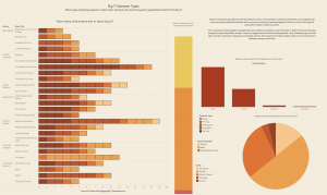
Step 1 – Create a bar chart for stories (How many characters are in each story?)
I created a bar chart to determine how many characters are in each story.
- Drag “author” from the dimensions menu to the rows bar
- Drag “story title” from dimensions menu and place it to the right of “author” on rows menu
- Drag “cultural geo-tagging” from the measures menu to the middle of the screen
- Click the “horizontal bars” on the show me menu
- Drag “character” from the dimensions menu on to the middle of the screen
- Click the “Color” option on the marks card and select the color black for the “borders.”
Step 2 – Create a bar chart (What are the races of the characters in the stories?)
I created a bar chart to determine the races of characters in each story.
- Drag “race” from the dimensions menu to the columns bar
- Drag “cultural geo-tagging” from the measures menu to the rows bar
- Click the button to re-sort the bar chart by descending order
Step 3 – Create a stacked bar chart (What is the gender ratio of characters in the stories?)
I created a stacked bar chart to determine the ratio of men to women characters in each story.
- Drag “character gender” from the dimensions menu to the column bar
- Drag “cultural geo-tagging” from the measures menu to the rows bar
- Click the “stacked bar chart” from the Show Me menu
Step 4 – Create a Pie Chart (In what manner did characters die in the story?)
I created a pie chart to determine how many characters died in each story.
- Drag “Death” from the dimensions menu to the rows bar
- Drag “cultural geo-tagging” from the measures menu to the columns bar
- Click the “pie chart” option from the Show Me menu
- Right click on “null” and exclude the option/category from the pie chart
Step 5 – Create a dashboard and arrange the sheets
I created a dashboard and arranged all of the information on the sheet.
- Arrange the sheets on the dashboard
- Change to the “floating” option to be able to navigate and arrange the items freely.
- Click the “use filter” option on each visualization to make the charts interact with one another when an option is selected
- Change the color
- Add images
- Add text
- Remove unwanted titles and gridlines
By Lindsey Dixon & Kenton Rambsy
