Part 3. FLOAT Case Studies
3.8 Black Short Stories & Settings
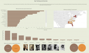
Black Short Stories & Settings
Projection Rationale: The stories by the Big 7 are set in a variety of locations across the United States. In addition, different types of setting such as lakes, kitchens, stores, and other locales are featured throughout stories. This project charts the types of geographic locations and place-settings that appear across select short stories.
Visualization Description: This visualization offers an overview of select stories by the Big 7. By clicking on the map or individual story, the chart responds helping readers sift through the information.
Formulate – A Research Question
Exploratory Question:
- What types of settings are used the most in short stories by Black writers?
Explanatory Question (I revised my research questions during the fourth step in process, analyze):
- What are the word counts of each story?
- Where are the Big 7’s stories set?
- Which types of settings are used in the stories collectively?
- What is the narrative mode of each story?
- Do the stories contain flashbacks?
- What authors stories are in the data collection?
Locate – A Data Source
For this project, I used two datasets: “Cultural geo=tagging Big 7 Overview” & “Cultural geo-tagging Big 7 Settings” These pre-assembled datasets are published on the subverse of the Texas Data Repository. The “Black Studies Data Verse” has datasets related to an assortment of topics in Black literature and Black studies in general. The information is already cleaned and organized in a coherent manner.
Organize – Your Data
This information already came organized in both datasets. It has a data dictionary that explains the organization and components of the datasets.
- “Cultural geo=tagging Big 7 Overview” – Author, Story Title, Publication Year, Setting, Region, State, City, Words, Types, Ratio, Words/Sentence, Narrative Mode, Duration of Action, Flashback-Dream Sequence, Interracial Violence, Intra-racial violence, Domestic violence, Death
- “Cultural geo-tagging Big 7 Settings” – Author, Story title, Setting, Location Type, Location Name, Notes
Analyze – Your Data
For this project, I created a series of bar charts and did a comparative analysis of each story and various settings. I was able to determine various factors related to each story and perform a comparative analysis.
Tell — A Data Story
Pre-Step: Combine datasets
- Download both datasets to your computer
- Drag and drop the “overview” dataset to the middle of the screen
- Edit the dataset accordingly: Change “Publication year” to a string
- Drag and drop “Settings” dataset to the middle of the screen
- Combine both datasets by selecting “story title” in both datasets
Step 1 – Create a bar chart (What are the word counts of each story?)
I wanted to determine which stories had the longest word counts.
- Drag “Story title” from the dimensions menu to the rows bar
- Drag “words” from the number menu to the middle of the screen
- Press the sort button to arrange the items in descending order
- Drag “words” from the numbers menu to the “label” option on the marks card
- Drag and drop the following categories on the Tool tip bar: Story title & author
Step 2 – Create a map (Where are the Big 7’s stories set?)
I wanted to visualize which states the stories were set.
- Drag “state” from the dimensions menu and drop it in the middle of the screen
- Drag “Cultural geo-tagging settings” from the numbers menu to the middle of the screen
- Use the “show me” bar and select “maps”
Step 3 – Create a bar chart (Which types of settings are used in the stories collectively?)
I wanted to determine which types of settings appeared in the stories.
- Drag “Location type” from the dimensions category to the columns bar
- Drag “Cultural geo-tagging settings” from the numbers menu to the rows bar
- Drag and drop the following categories on the Tool tip bar: Story title & author
Step 4 – Create a packed bubble (What is the narrative mode of each story?)
I wanted to determine the narrative mode of each story.
- Drag “narrative mode” from the dimensions category to the middle of the screen
- Drag “Cultural geo-tagging overview” from the numbers menu to the middle of the screen
- Use the “Show me” bar and select “packed bubble”
Step 5 – Create a packed bubble (Do the stories contain flashbacks?)
I wanted to determine in the stories contained flashbacks.
- Drag “flashback” from the dimensions category to the middle of the screen
- Drag “Cultural geo-tagging overview” from the numbers menu to the middle of the screen
- Use the “Show me” bar and select “packed bubble”
Step 6 – Create an author selection table (What authors stories are in the data collection?)
I wanted to create a interface to for each author.
Add Images to Tableau Repository Shapes Folder
- Download an image of each writer using Google Images
- Upload the images to the shapes folder in “My Tableau Repository”
- Locate and click on documents folder on your computer
- Locate the “My Tableau Repository” and click on it
- Locate the “shapes” folder and click on it
- Create a folder and label it “Big 7 writers” and add the downloaded images to this folder
Create chart
- Drag “author” from the dimensions menu to the columns bar
- Select the drop down menu on the marks card and select “shapes”
- Drag “author” from the dimensions menu to the shapes option on the marks card
- Replace each shape with an author photo
Step 7 – Create a dashboard and arrange the sheets
I created a dashboard and arranged all of the information on the sheet.
- Arrange the sheets on the dashboard
- Change to the “floating” option to be able to navigate and arrange the items freely.
- Click the “use filter” option on each visualization to make the charts interact with one another when an option is selected
- Change the color
- Add images
- Add text
- Remove unwanted titles and gridlines
By Lindsey Dixon & Kenton Rambsy
