Part 1. Putting Data Driven Research In Perspective
1.5 What is Data Storytelling?
What is Data Storytelling?
Data Storytelling is the process of creating visual narratives using quantitative and qualitative information. Brent Dykes defines data storytelling as “a structured approach for communicating data insights, and it involves a combination of three key elements: data, visuals, and narrative.” The presentation of information using graphs, brief text descriptions, charts, images, video, and multiple colors engages audiences beyond the standard conventions of words, numbers, and sentences.
In the field of journalism, practitioners frequently use the term “data-driven journalism,” which refers to analyzing and filtering large datasets for the purpose of creating news stories. Others use the term “digital storytelling.” However, we prefer data storytelling for our purposes because it serves as an umbrella term to describe general, interrelated approaches to using data to create narratives.
In this chapter, we will explain how data storytelling is an essential skillset that relates to all majors and disciplines and discuss how the production of interactive visuals informed by data creates opportunities to communicate trends and discoveries in captivating ways.
Keywords: Data Visualization, Data Storytelling, Tableau Public,
Teaching Data Storytelling with Beyonce
In the twenty-first century, large numbers of professors are calling for teachers and students to rethink the traditional essay and expand the types of compositions we can produce in writing classes in the digital age. In “Dominant Genre Emeritus,” Adam Banks surmises “any approach to writing instruction that we design or advocate for in this moment must deal in depth with both the challenges and possibilities posed by our relationships with technologies.” The rise in digital technologies has shifted how we perform research and teach students how to write. The amount of data available at our fingertips changes the types of compositions we can create related to a variety of subjects.

In a 2019 senior seminar class, #TheBeyonceExperience, the renowned singer served as a crucial focal point to draw parallels between Black literary art and Digital Humanities. My main reason for teaching the course on Beyonce is because she was a tremendously compelling cultural figure, and her career and popularity gave way to an enormous body of enriching numerical and visual data on the Houston-born crooner. As it turned out, Beyonce was the subject of remarkable data visualization in my class.
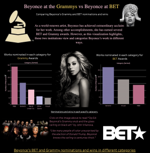
One student, Lucien Li, created a Tableau Public visualization based on the 53 Grammys and BET awards that Beyonce had won since 2003 as a solo artist. The student’s chart highlighted the fact that for the Grammys, Beyonce’s awards were mostly located in the “urban” category. The data story dramatized the contrast between Grammys and BET awards in ways that a conventional essay could not.
Her data story responded to an Op-Ed published in the Los Angeles Times, “Beyoncé’s Grammy snub and the glass ceiling on black art” by John Vilanova. He explained that “even though Beyonce is the most Grammy-nominated woman ever (with 62 nominations and 22 wins), her win rate of 35% is markedly low.” Vilanova wrote that “Eighteen of Beyoncé’s 22 wins have come in overtly racialized categories, such as R&B and rap. She has only one win in the ‘big three’ categories – best album, best song, best record – despite 11 nominations in them.”
The article, particularly the numbers of percentages, inspired my student to explore this concept visually and explain how even though Beyonce is one of the most visible artists, the Grammy awards typecasted her as a Black or urban artist. Numerical data about Beyonce was the gateway through which Lucien could begin to consider what institutional barriers impeded upon Beyonce’s—one of the most visible and successful Black women—institutional success. Moreover, the information facilitated the creation of an engaging data visualization.
The process of data storytelling contained several moving parts. A data-filled editorial triggered an inspiring idea, which in turn led to a comparative analysis and a thoughtful interactive graphic. Lucien’s Tableau Public visualization underscored the power of data storytelling. The visualization succinctly blended numerical data and concepts in the production of a useful narrative.
Teaching Data Storytelling Across Academic Disciplines

Since the summer of 2018, I have directed Howard University’s Mellon-Mays Undergraduate Summer Institute. Over the course of three weeks, students are given a crash course in Digital Humanities methodologies as they also work to develop a research projects. Since Fellows come from a variety of majors ranging from History and Theatre to English and Philosophy, I find data storytelling to be a useful approach for introducing students to DH methodologies. No matter the discipline, data storytelling is a useful skillset for scholars to acquire.
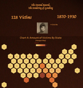
In the summer of 2020, I met rising junior political science student Lindsey Dixon. She was interested in examining the frequency of lynching that occurred in the South. Inspired by the earlier work of Ida B. Wells, Lindsey analyzed over 1,000 data points related to lynching. She wanted to understand how Black women experienced this horrifying treatment.
Lindsey created a dataset and later transformed that information into an interactive visualization using Tableau that highlighted the horrors of lynching across the United States with special attention on Black women victims. According to Lindsey, “Tableau helps me communicate my research because it makes information much easier to digest … I think the visualizations can draw people in who otherwise may not have been interested.” The visualization facilitated Lindsey’s ability to make accounts of over 1,000 murders visually accessible. Moreover, she was able to bring attention to the women victims and draw comparisons and contrasts to their deaths.
Even though Lindsey studies political science and I study literature, I guided her engagements with data curation and eventually helped her to produce an interactive visualization related to her findings. Her cohort of fellow Mellon Mays Fellows, who majored in various fields, took similar paths to creating visualizations.
Data storytelling creates opportunities for researchers from a variety of fields to present their findings. Different from data visualizations, data storytelling seeks to relay a cohesive narrative using datasets. Through visual graphs, audience members can comprehend large amounts of data and consider findings related to important patterns.
Getting Started with Data Storytelling and Tableau Public
In the Spring of 2016, I taught “The Life and Times of S. Carter,” also known as #TheJayZClass for the very first time—a digital humanities (DH) class. I used Jay-Z as a gateway figure to teach students about African American literature and digital methodologies.
In #TheJayZCLass, students created a data story using Tableau Public that corresponded to themes relating to Jay-Z and African American literature. For black artists, certain kinds of allusions (or simply signifying) constitutes a crucial element of black artistic expression. Henry Louis Gates wrote in the introduction to the 25th Anniversary Edition of The Signifying Monkey, “Without a doubt, the most prevalent manifestation of signifying over the last four decades is to be found in the corpus of hip-hop music.” He continues, “You might say that hip-hop is signifying on steroids.” And, as a rapper, Jay-Z is fond of signifying on words, phrases, and musical compositions from a wide range of source materials. Jay-Z and his producers incorporate hundreds of lyrical and instrumental samples into his body of work.
Below is a fifteen minute “how-to” video by my former student Zach Roe. Drawing on The JayZ Samples Dataset, he explained how to create a Tableau Public visualization and revealed how sampling occurs on Jay-Z’s thirteen solo albums. In order to do this exercise, you must first create a Tableau Public account and download the application to your computer.
Key Takeaways – What is Data Storytelling?
- Data storytelling is useful for DH research because it can be used to graphically represent or illustrate research findings.
- Data storytelling allows for users to present large scales of data in palatable ways that audiences can understand.
- Having access to structured data is crucial for data storytelling.
- Transforming data into visualizations is considered the last step in the data storytelling process
By Kenton Rambsy
(See bibliography for sources)
Media Attributions
- Private: Figure 1.5.1 – Beyonce at the Grammys vs Beyonce at BET © Luicen Li
- Figure 1.5.2 – The Unread Record: The Gendering of Lynching © Lindsey Dixon
Data visualization refers to the techniques used to communicate data or information by encoding it as visual objects (e.g., points, lines or bars) contained in graphics. The goal is to communicate information clearly and efficiently to users.
Data storytelling is the practice of building a narrative around a set of data and its accompanying visualizations to help convey the meaning of that data in a powerful and compelling fashion.
Tableau Public is free software that can allow anyone to connect to a spreadsheet or file and create interactive data visualizations for the web.

