Part 3. FLOAT Case Studies
3.4 Beyoncé & Black Feminism
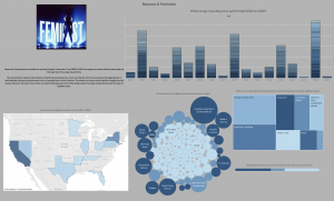
Beyoncé & Black Feminism
Project Rationale: Beyoncé’s live performances reflect her growing interest in feminism. From 2002 to 2020, her songs pro-women anthems have made up the majority of the songs she performs.
Visualization Description: This visualization interprets the timeline of performances by Beyoncé by year, location, and theme. Users can interact with the visualization by toggling back in forth between the type of performance, manipulating the timeline, or clicking on a particular state.
Formulate – A Research Question
Exploratory Question:
- How have Beyoncé’s live performances reflected her growing interest in Black feminism?
Explanatory Question (I revised my research questions during the analyzing process):
- What songs have Beyoncé performed 2002 to 2020?
- What are the themes of the song’s Beyoncé has performed over the past eighteen years?
- Did Beyoncé perform at an awards show, music festival, or live event?
- At which events has Beyoncé performed the most songs?
- Which places did Beyoncé perform from 2002 to 2020?
Locate – A Data Source
For this project, I used the “Storytelling with Data – The Beyoncé Edition Dataset, Live Performances.” This pre-assembled dataset is published on the subverse of the Texas Data Repository. The “Black Studies Data Verse” has datasets related to an assortment of topics in Black literature and Black studies in general. The information is already cleaned and organized in a coherent manner.
You can access this information by going to this website here.
Organize – Your Data
This information already came organized. It has a data dictionary that explains the organization and components of the dataset. The dataset has 8 main categories: Song Title/Album Title, Date, Event, Event Type, Special Guest, City, State, Country.
Analyze – Your Data
For this project, I edited the original dataset and added column b “Song theme.” I analyzed each individual song and categorized it by one of the following themes:
- Crazy In Love
- Female Empowerment
- Love Song- Ballad
- Love Song – Pop Song
- Other
- Song Cover
The revised dataset can be accessed here.
Tell— A Data Story
Step 1 – Create a bar chart (What songs have Beyoncé performed 2002 to 2020?)
I created a bar chart to illustrate how many collaborators (and what role they played) on Jay-Z’s 13 solo albums.
- Drag “Year” from the dimensions menu and place it in the columns bar.
- Drag “Beyonce – Live Performances” from the measures to the rows.
- Use the “Show Me” tab to change the chart to a bar chart
- Drag “Song title/Album name” on the middle of the screen
- Drag “Event” on the middle of the screen
- Drag “song theme” onto the Color option on the marks card.
- Click on the “Color” option on the Marks card and highlight the color black under the “border” menu.
Step 2 – Create a tree map (What are the themes of the song’s Beyoncé has performed over the past eighteen years?)
I created a tree map to display the portion of themes in the songs Beyoncé performed from 2002 to 2020
- Drag “Song theme” from the dimensions menu to the middle of the screen.
- Drag “Beyonce – Live Performances” from the middle of the screen
- Click the “tree map” option on the show me menu.
- Drag “song theme” onto the Color option on the marks card.
Step 3 – Created a stacked bar chart (Did Beyoncé perform at an awards show, music festival, or live event?)
I created a stacked bar chart to visualize the types of events Beyoncé has performed at over the last two decades.
- Drag “Event type” from the dimensions menu and drop it on the middle of the screen
- Drag “Beyonce – Live Performances” from the measures to the middle of the screen
- Click the “stacked bars” option on the Show Me tab
Step 4 – Create a packed bubble chart (At which events has Beyoncé performed the most songs?)
I created a packed bubble chart to visualize select events Beyoncé has performed at from 2002 to 2020.
- Drag “events” from the dimensions menu to the middle of the screen
- Drag “Beyonce – Live Performances” from the measures to the middle of the screen
- Click the “packed bubble” option on the show me menu
- Drag “Event type” from the dimensions menu to the “color” option on the Marks Card.
Step 5 – Create a map (Which places did Beyoncé perform from 2002 to 2020?)
I created a map to visualize select performances by Beyoncé across the continental US
- Drag state from the dimensions menu and drop it in the middle of the screen
- Select the “maps” option from the Show Me menu
- Drag “Beyonce – Live Performances” from the measures to the middle of the screen
Step 6 – Create a Dashboard
I created a dashboard and arranged all of the information on the sheet.
- Arrange the sheets on the dashboard
- Change to the “floating” option to be able to navigate and arrange the items freely.
- Click the “use filter” option on each visualization to make the charts interact with one another when an option is selected
- Change the color
- Add images
- Add text
- Remove unwanted titles and gridlines
By Lindsey Dixon & Kenton Rambsy
