Part 2. The FLOAT Method
2.2 Formulate
Formulate a Research Question
Tips for Developing Research Questions:
- Make sure the question clearly states what the researcher needs to do.
- If working with tabular data, think in terms of how your question really relates one column to one or more others.
- The question should have an appropriate scope. If the question is too broad it will not be possible to answer it thoroughly within the word limit.
- If it is too narrow you will not have enough information to interpret and develop a strong argument.
- You must be able to answer the question thoroughly within the given timeframe and word limit.
- You must have access to a suitable amount of quality research materials, such as academic books and refereed journal articles to back up data driven assertions.
Formulate

When formulating a research question that hinges on data, there is no set way to go about creating the core question. Different disciplines have their own distinct priorities and requirements. Still, there are some tips that facilitate this process. The research process contains many different steps such as selecting a research methodology to reporting your findings. Whether the objective is qualitative or quantitative in nature determines which type or types of research questions should be utilized.
Types of Research Questions
There are several different types of questions you can pose. We have provided three below to get started:
Descriptive
Descriptive research questions describe the data. The researcher cannot infer any conclusions from this type of analysis; it simply presents data. Descriptive questions are useful when little is known on a topic, and you are seeking to answer what, where, when, and how, though not why.
Examples of Descriptive Questions:
- What are the top 10 most frequently anthologized short stories?
- Who are the top 10 most frequently anthologized short story writers?
- To what extent do the 10 most frequently republished short stories change over time?
Comparative
Comparative research questions are assessed using a continuous variable and/or a categorical grouping variable, in conjunction with two categorical grouping variables. Comparative questions are useful for considering the differences between subjects.
Examples of Comparative Questions:
- What are the differences in samples from the 1970s used on Jay-Z’s first album compared to his last album?
- What is the difference in between the number of vocal samples and instrumental samples across Jay-Z’s solo albums?
- Which of Jay-Z’s albums included the most vocal samples from the 1990s?
Relationship-Based
Relationship-Based Research Questions (also known as correlational) questions are useful when you are trying to determine whether two variables are related or influence one another. Be mindful that “causation is not correlation,” which means that just because two variables are related (correlated), does not mean that one of those things determines (causes) a particular outcome.
Examples of Descriptive Relationship-Based Questions:
- Does the number of awards received annually increase as an artist’s total number of awards increases?
- What is the relationship between geographical wage data and home ownership?
Steps to Formulating a Research Question: Exploratory Data Analysis
A good way to begin formulating a research question is to use Exploratory Data Analysis (EDA). The point of EDA is to take a step back and take a broad assessment of your data. EDA is just as important as any part of a data project because datasets are not always clear. They also are often messy, and many variables are inaccurate. If you do not know your data, how are you going to form a logical question or know where to look for sources of error or confusion?
EDA is a subfield of statistics that is frequently used in the digital humanities to get acquainted with and summarize data sources. EDA often evokes new hypotheses and guides researchers toward selecting the appropriate techniques for testing. EDA can stand alone, especially when working with large datasets, but it must also be completed before statistical analysis is conducted to avoid blindly applying models without first considering the appropriateness of the method. EDA is concerned with exploring data by iterating between summary statistics, modeling techniques, and visualizations.
Summary or Descriptive Statistics
Descriptive statistics are summary information about your data. They offer a quick description of the data which allows ease of understanding at the onset of exploring the data. The most common descriptive or summary statistics one may gather from data are measures of central tendency (like means), data spread and variance (like the range). Here are the most common approaches:
Central Tendency – i.e., seeing where most of your data fall on average.
There are different reasons for selecting one or more of the three measures of central tendency. The arithmetic mean (or average) is the most popular and well known measure of central tendency because it can be used with both discrete and continuous data (although its use is most often with continuous data). However, it is not always the best choice for every data variable. Let us use an example to understand these measures of central tendency and why each is important.
- Mean – to calculate the mean, you add all the data for a variable together and divide the total by the number of data points.
- Median – to calculate the median, you sort your data by size. Then, the value where half the data is above and half the data are below is the median.
- Mode – to get the mode, you select the number which most frequently occurs in the data.
If the data fall under a normal distribution, or “Bell curve,” then that would lead to the mean, median, and mode all having the same value. Looking at the Descriptive Statistics Example to the right, where these values differ, which measure of central tendency is most accurate in describing the central value for that variable?
As you work with data, you become familiar with cases in which one or two are not as accurate than the other(s). In this case, the mean is not as accurate in describing the data due to the large outlier (or point that is drastically different from the others) with one piece of material measuring 100 inches.
Data Spread and Variance – i.e., the range and difference among the data points.
The easiest way to describe the spread of data is to calculate the range. The range is the difference between the highest and lowest values from a sample. This is very easily calculated. However, since it is only dependent upon two scores it is very sensitive to extreme values. The range is almost never used alone to describe the spread of data. It is often used in conjunction with the variance or the standard deviation. The variance provides a description of how spread out the data you collected is. The variance is computed as the average squared deviation of each number from its mean. However, rather than computing the calculation for variance, you can use another common approach.
This alternate common approach is the five-number summary, which gives the minimum, lower quartile, median, upper quartile, and maximum values for a given variable. A quartile represents 25% of your data range. So, the lower quartile (or the first quartile) is the 25th percentile, while mean (or the second quartile) is the 50th percentile. The upper quartile (or the third quartile) is the 75th percentile. These compactly describe a robust measure of the spread and central tendency of a variable while also indicating potential outliers. When we refer back to the Descriptive Statistics Example, we can see the values for spread are below:
- Minimum – 1 in
- Lower Quartile – 3.5 in
- Median – 5 in
- Upper Quartile – 8.5 in
- Maximum – 100 in
- Range – 99 in
- Interquartile Range – or the range between the lower and upper quartile, is 5 in
Using these numbers, you can quickly see that most of the data are low numbers with a possible large outlier or two. Of course, that is easy to tell with the data provided, since there were only 9 original data points. However, if you have a large dataset with hundreds or thousands of values, calculating the data spread and variance measures can give you a snapshot of where all your data fall.
Further Practice
Download the dataset and data dictionary for The Black Short Story Dataset – Vol. 1 in Mavs Dataverse at https://doi.org/10.18738/T8/5TBANV (Rambsy et al.). Look at a variable, such as “Original Publication Year” to determine the average year the publications in the dataset were published? Calculate the mean, median, and mode to see which of these are most accurate. Then calculate the values of data spread and variance to see when all and most of the short stories were originally published. What trends do you see? If you were to look at some of these measures across some of the variables of interest to you, do you think you would have a better understanding of the dataset? If so, try to formulate a potential question, using the research question types above, about the dataset.
Visualizations
Data visualizations, like histograms, boxplots, scatterplots, and word clouds, can also be used to augment or better understand datasets. These are typically used to show distributions, ranges, and variance. We are visual creatures, and making use of a visualization to see what data exist is useful for researchers ourselves. Visualizing your data in various ways can help you see things you may have missed out on in your early stages of exploration. Here are four go-to visualizations to utilize. For example, in the following sets of data, these are identical when examined with summary statistics, but they vary greatly when visualized.
The Power of Visualizations: Anscombe’s Quartet
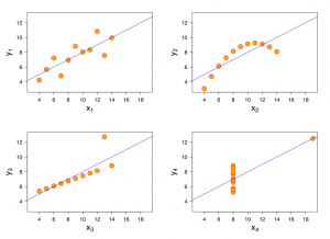
This graphic represents the four datasets defined by Francis Anscombe for which some of the usual statistical properties (mean, variance, correlation and regression line) are the same, even though the datasets are different. Reference: Anscombe, Francis J. (1973) Graphs in statistical analysis. American Statistician, 27, 17–21.
Histograms
The histogram shows the distributions of numeric values for a variable. It is different than a bar chart because it shows the frequency of “bins” of values for a particular variable. To create a histogram, you would determine how large bins would be. In the case of the figure below, bins are by 3s, or they represent numbers 0, 1-3, 4-6, and so on until it reaches the last bin of 100-102. Much like the measures above, a histogram can tell you the most frequent values, whether the values follow a normal distribution, and whether there are outlying values.

Boxplots
Scatterplots and boxplots show patterns between variables, a strategy particularly important when simultaneously analyzing multivariate data. The boxplot is a visualization of the measures of data spread and variance provided above.

Scatterplots
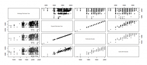
A scatterplot displays whether there is some kind of a relationship exists between any two numeric variables in your dataset. Typically the relationship is linear – in a straight line. A positive relationship is when more of one variable tends to go along with more of the other and vice versa (like longer study hours being correlated with higher grades). A positive relationship is apparent when the dots form a rising line. A negative relationship is when less of one leads to more of the other and vice versa (like how more hours exercising is correlated with lower body weight). A negative linear relationship is apparent when the dots form a falling line. However, you may find the data fall in other ways, such as exponential relationships. Plotting your points will allow you to know your data, and it will prevent serious assumptions in your analysis later (see the Anscombe’s Quartet example earlier). In the scatterplot matrix below, we can see that, as expected, publication year and publication decade are linearly positively related. But, we can also see a relationship between author’s birth decade and when they published their short story, which means there could be a story behind a certain age at which most people are likely to publish their significant works.
Scatterplot Matrix of Numeric Variables in The Black Short Story Dataset
Word Cloud
A word cloud is a fourth visualization method. It is useful to determine crucial information when your raw data is text-based. It specifically visualizes frequency of text, where larger words are those that are found more frequently in the dataset.

Voyant Tools is a popular humanities tool for exploring data, including the development of word clouds. Visit Chapter 4.4 Voyant Tools for steps to use it.
Conclusion
Going through this process of understanding your data is vital for more than just the reasons I have mentioned. It might also eventually help you make informed decisions when it comes to selecting your model. The methods and processes outlined above are recommended for exploring a new dataset. There are so many more visualizations that you can use to explore and experiment with using your dataset. Don’t hold yourself back. You’re just trying to look at your data and understand it.
Not sure what visualization is best? Read Chapter 2.5: Tell, which goes further into visualizations and can help with selection.
By Peace Ossom-Williamson
Arnold, Taylor, and Lauren Tilton. “New Data? The Role of Statistics in DH.” Debates in Digital Humanities, edited by Matthew K. Gold and Lauren F. Klein, University of Minnesota, 2019. © [fair use analysis].Portions of the chapter are adapted from the following sources:
Gupta, Aamodini. “Exploring Exploratory Data Analysis.” Towards Data Science, 29 May 2019, https://towardsdatascience.com/exploring-exploratory-data-analysis-1aa72908a5df. © [fair use analysis].
Hoffman, Chad. “Lesson 3: Basic Descriptive Statistics.” Statistics, 2007, https://www.webpages.uidaho.edu/learn/statistics/lessons/lesson03/3_1.htm. ©[fair use analysis].
Media Attributions
- Figure 2.2.1 – Formulate Triangle © Peace Ossom-Williamson is licensed under a CC BY (Attribution) license
- Figure 2.2.2 – Anscombe’s Quartet © Francis J. Anscombe is licensed under a CC BY-SA (Attribution ShareAlike) license
- Figure 2.2.3 – Histogram of Lengths © Peace Ossom-Williamson is licensed under a CC BY (Attribution) license
- Figure 2.2.4 – ex-boxplots © Peace Ossom-Williamson is licensed under a CC BY (Attribution) license
- Figure 2.2.5 – Scatterplot Matrix © Peace Ossom-Williamson is licensed under a CC BY (Attribution) license
Descriptive research questions simply aim to describe the variables you are measuring. When we use the word describe, we mean that these research questions aim to quantify the variables you are interested in. Think of research questions that start with words such as "How much?", "How often?", "What percentage?", and "What proportion?", but also sometimes questions starting "What is?" and "What are?". Often, descriptive research questions focus on only one variable and one group, but they can include multiple variables and groups.
Source: https://dissertation.laerd.com/types-of-quantitative-research-question.php
Comparative research questions aim to examine the differences between two or more groups on one or more dependent variables (although often just a single dependent variable). Such questions typically start by asking "What is the difference in?" a particular dependent variable (e.g., daily calorific intake) between two or more groups (e.g., American men and American women).
Source: https://dissertation.laerd.com/types-of-quantitative-research-question.php
Whilst we refer to this type of quantitative research question as a relationship-based research question, the word relationship should be treated simply as a useful way of describing the fact that these types of quantitative research question are interested in the causal relationships, associations, trends and/or interactions amongst two or more variables on one or more groups. We have to be careful when using the word relationship because in statistics, it refers to a particular type of research design, namely experimental research designs where it is possible to measure the cause and effect between two or more variables; that is, it is possible to say that variable A (e.g., study time) was responsible for an increase in variable B (e.g., exam scores).
However, when we write a relationship-based research question, we do not have to make this distinction between causal relationships, associations, trends and interactions (i.e., it is just something that you should keep in the back of your mind). Instead, we typically start a relationship-based quantitative research question, "What is the relationship?", usually followed by the words, "between or amongst", then list the independent variables (e.g., gender) and dependent variables (e.g., attitudes towards music piracy), "amongst or between" the group(s) you are focusing on.
Source: https://dissertation.laerd.com/types-of-quantitative-research-question.php
In statistics, exploratory data analysis is an approach of analyzing data sets to summarize their main characteristics, often using statistical graphics and other data visualization methods. A statistical model can be used or not, but primarily EDA is for seeing what the data can tell us beyond the formal modeling or hypothesis testing task.
Source: https://en.wikipedia.org/wiki/Exploratory_data_analysis
A descriptive statistic (in the count noun sense) is a summary statistic that quantitatively describes or summarizes features from a collection of information, while descriptive statistics (in the mass noun sense) is the process of using and analysing those statistics. Descriptive statistics is distinguished from inferential statistics (or inductive statistics) by its aim to summarize a sample, rather than use the data to learn about the population that the sample of data is thought to represent. This generally means that descriptive statistics, unlike inferential statistics, is not developed on the basis of probability theory, and are frequently non-parametric statistics. Even when a data analysis draws its main conclusions using inferential statistics, descriptive statistics are generally also presented.
Source: https://en.wikipedia.org/wiki/Descriptive_statistics
