Part 3. FLOAT Case Studies
3.6 Short Stories & 100 Anthologies
Short Stories & 100 Anthologies
Project Rationale: This project considers the circulation history of Black short stories. There is no shortage of short fiction. In one hundred anthologies published since 1925, there are a total of 632 unique short stories by 297 different black writers. Among those compositions included in collections though, editors published just one story by 181 writers. It is rare that a single story appears three or more times across 100 anthologies.
Data Story Description: This visualization illustrates the extent to which specific Black writers are routinely included in various collections and Using the filter, users can determine what type of anthologies republish the select works and how many stories by Black authors are included across 100 collections.
Formulate – A Research Question
Exploratory Question:
- How many short story writers are anthologized?
Explanatory Question (I revised my research questions during the analyzing process):
- How frequently are writers republished in anthologies?
- What anthology types—and what stories—are writers included across nine anthology types?
- In what years are there notable peaks with stories being published?
Locate – A Data Source
For this project, I used The Black Short Story Dataset – Vol. 1. This pre-assembled dataset is published on the subverse of the Texas Data Repository. The “Black Studies Data Verse” has datasets related to an assortment of topics in Black literature and Black studies in general. The information is already cleaned and organized in a coherent manner.
You can access this information by going to this website here.
Organize – Your Data
This information already came organized. It has a data dictionary that explains the organization and components of the dataset. The dataset has 15 main categories: Anthology Publication Year, Anthology Type, Anthology Title, Collection Type, Source Title, Source Genre, Original Publication Year, Publication Decade, Author, Author Birth Year, Author Birth Decade, Author Gender, Anthology Section Header, Anthology Edition, Anthology Editors.
The structure of the dataset is defined in the accompanying data dictionary.
Analyze – Your Data
I used Tableau Public to analyze my data. I began playing around the different visualizations to see how often writers had been republished across anthologies. I noticed there was a small number of writers who are frequently republished across the entire dataset. Anthologists, in a sense, tokenized certain short story writers.
I also noticed that different anthologies published only certain types of writers. The most frequently republished writers are more likely to appear across several anthology types. Certain special collections, sometimes, published several stories by a single writer.
My analysis lead me to revise my research questions:
- How frequently are writers republished in anthologies?
- What anthology types—and what stories—are writers included across nine anthology types?
- In what years are there notable peaks with stories being published?
Tell— A Data Story
Pre-Step: Gathering the data and inserting it into Tableau
This is how we will gather the data from the internet and insert it into the Tableau software. This method of gathering data will work for any website you go to.
- Go to Texas Data Repository (or wherever your data is located)
- Search “African American Short Stories” and select the dataset created by Dr.Rambsy
- Download the option that is called comma separated values Separated Values)
- Open tableau then drag and drop your dataset into the software
- Or you can go to Connect on the left bar and select the kind of file you have and upload your dataset that way
- Make Sure tableau read your data right and correct categories if they were read wrong
-
- Anthology Publication year should be a string
- Go to the left and select “string”
- Repeat for Original Publication Year, Author Birth Year
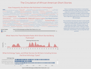
Step 1 – Create a word cloud (How frequently are writers republished in anthologies?)
I created a word cloud to comprehend the large number of short story writers who are frequently anthologized across 100 anthologies. The larger the word, the more times that particular writer has been included in anthologies.
- Drag “author” from the dimensions menu to the rows column.
- Drag “Measure values” onto the middle of the screen.
- A number next to each writer’s name should populate depending on the amount of times his or her story has been re-published
- Click the “Show me” bar and select “Treemaps” from the menu.
- The image should transform to a treemap that varies in size by how many times an artist was sampled
- Navigate to the “Marks” card, click the drop down menu, and select “text.”
- Drag the “author gender” from the dimensions tab to color on the Marks Card.
- Right click on the visualization to bring up the filters tab. Next, select the option “count of 100 anthologies and black short stories”
- This filter allows users to pull the tab from left to right and select the number of times writer is included in the collection.
Step 2 – Create a bar chart (What anthology types—and what stories—are writers included across nine anthology types?)
This bar chart visualizes how many stories are included in the nine types of anthologies.
- Drag “anthology type” from the dimensions menu and place it in the columns bar.
- Drag “Number of anthologies” from the measures to the rows.
-
- The chart should now reflect a bar display a horizontal bar chart for each album.
- Drag “source title” from the dimensions menu and drop the field on the bar chart.
- Drag and drop the following categories onto the “Tool tip” option on the Marks card: “author,” “source title,” and “original publication year”
-
- You can re-arrange the order of the text on the tool tip to suit your liking.
Step 3 – Create a discrete area chart (What years are there notable peaks with stories being published?)
I created a discrete area chart to visualize the various years where the most stories were republished in anthologies.
- Drag “Anthology publication year” from the dimensions menu and place it on the columns bar.
- Make sure the dimension “anthology publication year” is changed to a date instead of a string for this specific visualization.
- Drag “Number of anthologies” from the measures to the rows.
- Using the “show me” toolbar, click on the area chart (discrete) option
Step 4 – Create a dashboard and arrange the sheets
I created a dashboard and arranged all of the information on the sheet.
- Arrange the sheets on the dashboard
- Change to the “floating” option to be able to navigate and arrange the items freely.
- Click the “use filter” option on each visualization to make the charts interact with one another when an option is selected
- Change the color
- Add images
- Add text
- Remove unwanted titles and gridlines
